Website Updates and Markdown Editing
A style guide for keeping sfpc.io accessible
The web as we know it is built and standardized to be accessible for a wide variety of people. Browsers and phones have a variety of tools which assist experiencing the web however it’s accessed across a gradient of assistance. As an organization which publishes text and images frequently online, we owe it to people reading and interacting with SFPC to fully enable these browser accessibility tools. Activists, policy makers, and developers have paved the way so that we can make an experience for everyone. In that vein, here are a few tips to use when writing content for SFPC.
Image tagging
Wherever a image provides editorial information or context for a post or article, it should get tagged with an “alt-tag.” These are used when someone has a screen reader active, or when they’re using a device with a slower internet connection.
Perkins School for the Blind is a forefront resource on improving access and education for people who are blind. It’s a great institution, and they have some advice for tagging: https://www.perkinselearning.org/technology/blog/how-write-alt-text-and-image-descriptions-instagram Some simple guidelines for writing useful alt-tags:
- Do: provide information about the literal content of the image
- Don’t: Say that it is a “Photo of ___”, screen readers and browsers already know and indicate that it is an image, and people using readers are extremely efficient with them.
- Decide: whether to provide implied context of the image. It isn’t always helpful, but if it is a complex art piece which is very challenging to describe in one or two sentences, it may be a good idea to add abstract meaning.
For someone who has the ability, writing image tags is usually as simple as if you looked at a picture and tried to describe it to someone next to you in one or two sentences. Think back to when you’ve done that during a phone call, for instance. Perkins doesn’t recommend making the description hard to understand for the sake of accurately describing colors (e.g. https://colors.lol/.) Instead, it’s usually best to focus on the subject matter.
In the sfpc website when editing a page, the markdown for alternative text looks like this:
In some SFPC website pages, we use a carousel image “slide” system. In order to set up some slides, we might use markdown text at the top of a file like:
---
title: SFPC Creative Coding Bootcamp (online)
layout: participate
location:
contact: sfpc
slides:

  - "/static/img/bootcamp/bootcamp1.jpg"
  - "/static/img/bootcamp/bootcamp2.jpg"
  - "/static/img/bootcamp/bootcamp5.jpg"
  - "/static/img/bootcamp/bootcamp6.jpg"
---
Setting up slides as shown above doesn’t make that content accessible for people who use screen readers. Let’s add alternative text to the slides:
---
title: SFPC Creative Coding Bootcamp (online)
layout: participate
location:
contact: sfpc
slides:
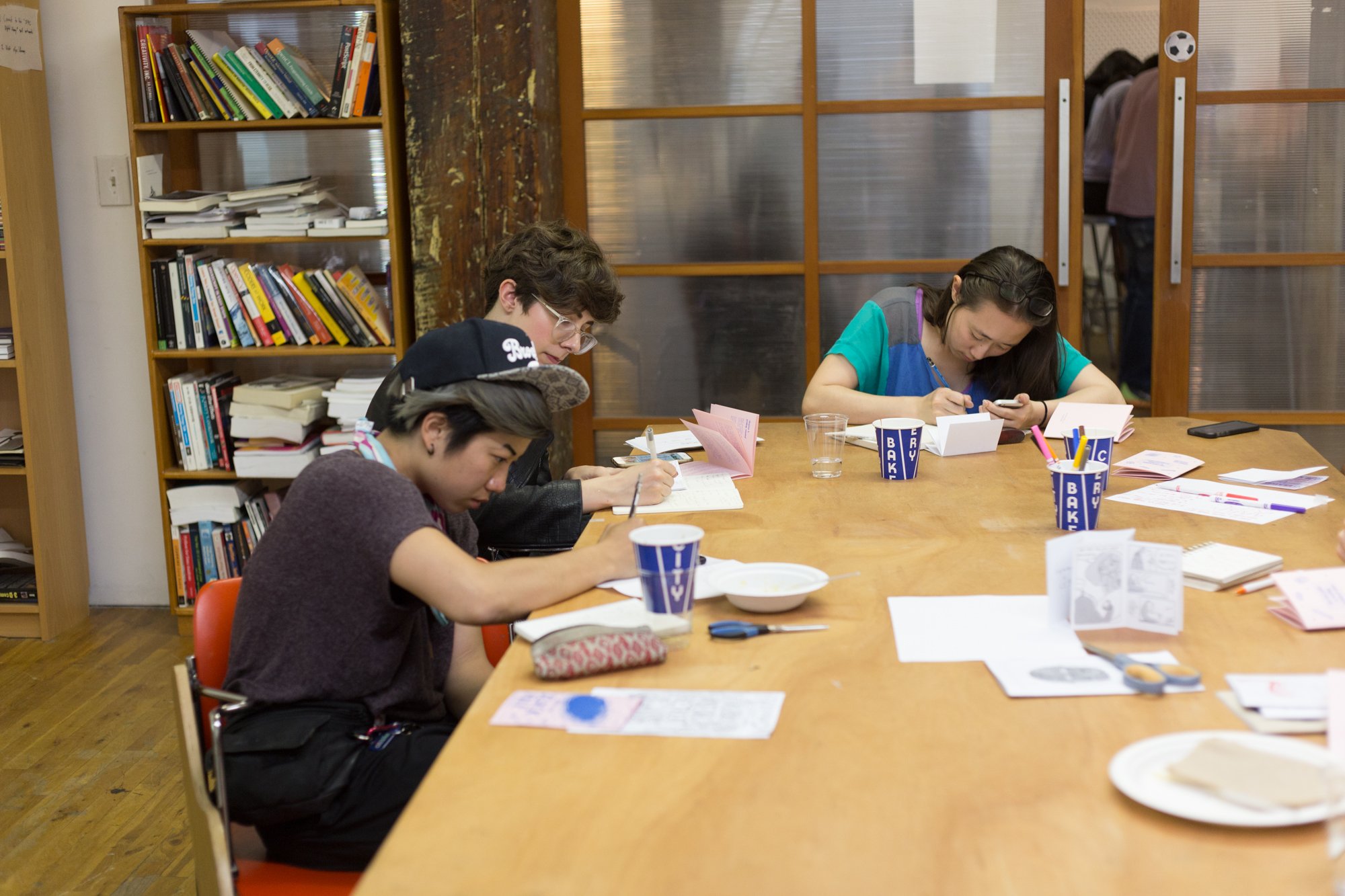
- image: "/static/img/bootcamp/bootcamp1.jpg"
alt: "people studying at laptops in theanthropical SFPC space"
- image: "/static/img/bootcamp/bootcamp5.jpg"
alt: "people comparing notes on paper and in code on a laptop"
- image: "/static/img/bootcamp/bootcamp6.jpg"
alt: "a group sfpc creative coding bootcamp photo, with projected stars on top"
---
Now, when people look at your page, they’ll be able to access the content of the image whether they’re looking at an image or using a screen reader to describe it.
Logotype images versus textuals
Whenever possible, format titles, text, etc as actual text rather than logo type or poster images. Posters which have information such as dates, times, and locations should have the text repeated in the article.
Contrast in graphics
For photography this isn’t such a concern, but for graphics and especially important ones, keeping the contrast high (avoiding hard to see colors) is a good idea.
It’s possible to check and quantify contrast, and many websites exist to help confirm. For instance these ones work well:
https://webaim.org/resources/contrastchecker/
General Examples
There is always a question of how much detail should get included in these descriptions. In addition to the guidance above, here is a short example:
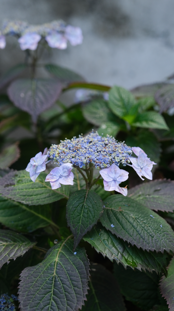
😊 a-ok! → “Blue hydrangea flowers soon after rain”
😤 functional, but too simple to be pleasant→ “Flowers”
😬 too long → “photo of light lavender hydrangea flowers after a recent rain set against a mottled concrete background, with 25 leaves present, and a small bite out of one leaf which could have been from a dog, but alternatively could have been a cute bug”
Social Media
https://sfpc.io/ isn’t the only place where people see content from SFPC, so it isn’t the only place where web access is a concern. Most external platforms have procedures for adding alt-text to images, and largely already follow requirements for contrast and other regulations. In this section are a few common services and how to describe images textually in them.
Blogging and Medium Posts
Largely, the Medium design team has this covered. Just make sure to add alternative text.
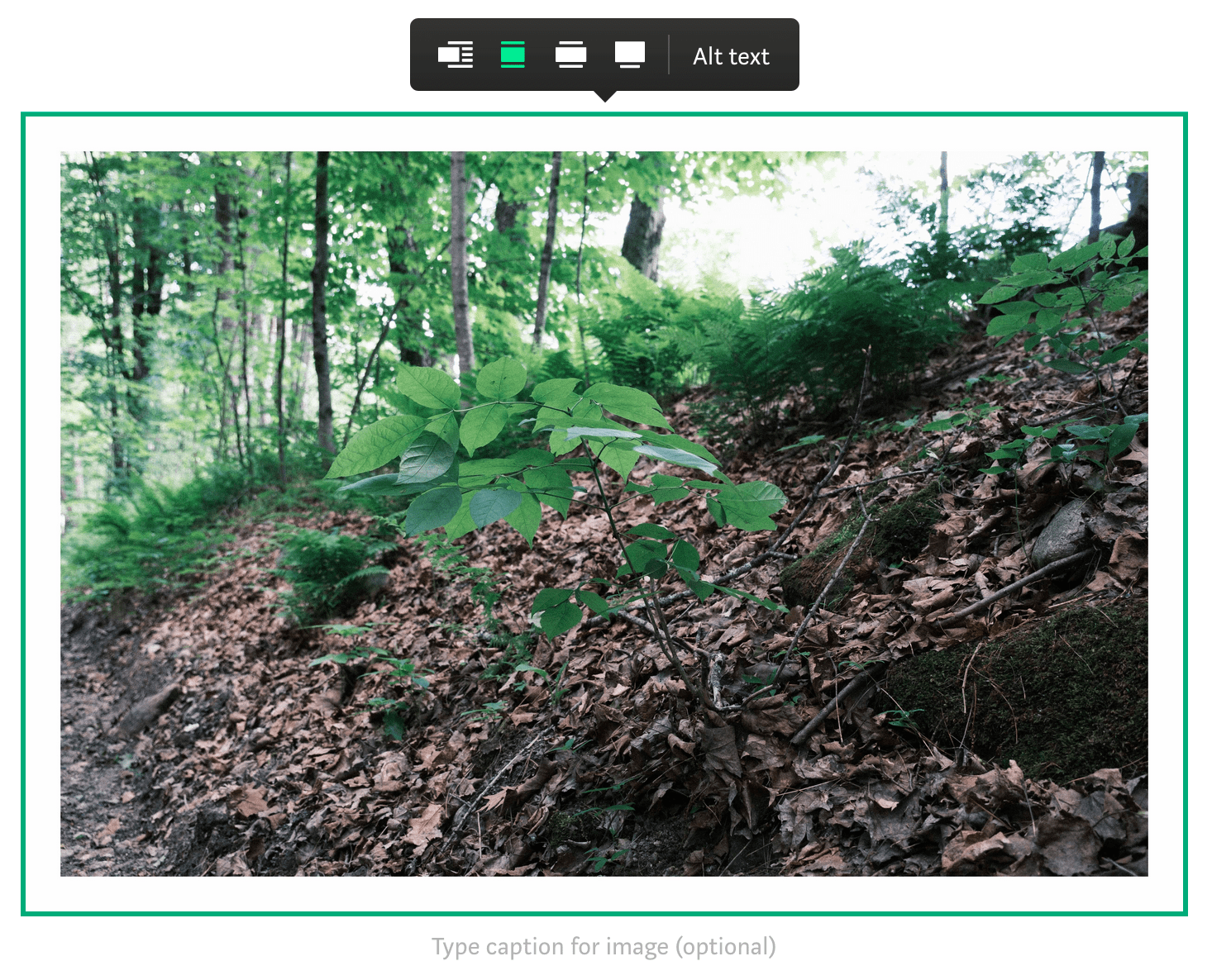
In the Medium editor, hovering over an image presents this view. Make sure to add a caption AND some alternative text. These serve different purposes.
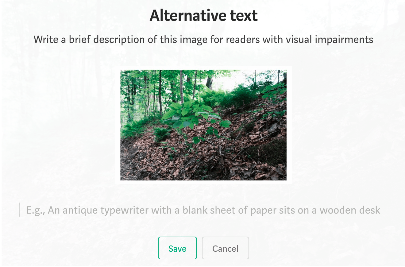
Clicking on the alt text button presents this view, from which it’s possible to edit and save descriptions.
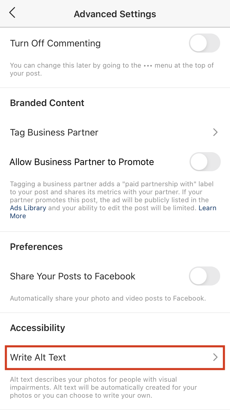
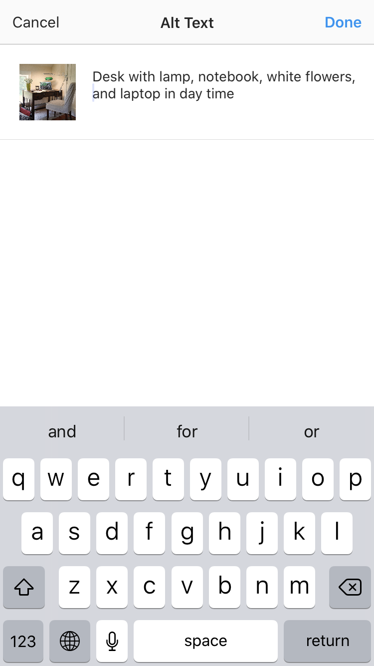
Official Instagram guide for adding alt text: https://help.instagram.com/503708446705527
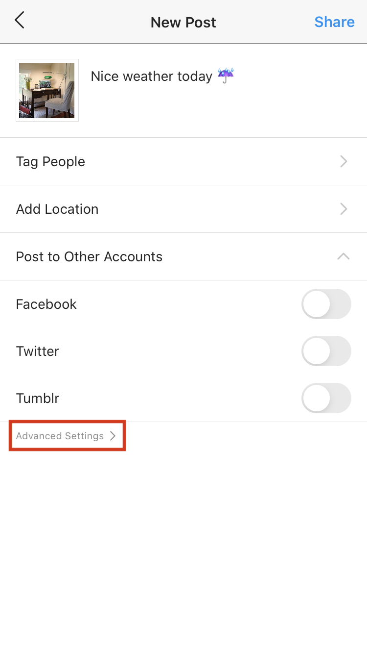
When posting, an example situation might look like this. Although Instagram uses machine learning to infer the contents of images and provide automatic alternative text, doing it manually will be much more usable and far more accurate.
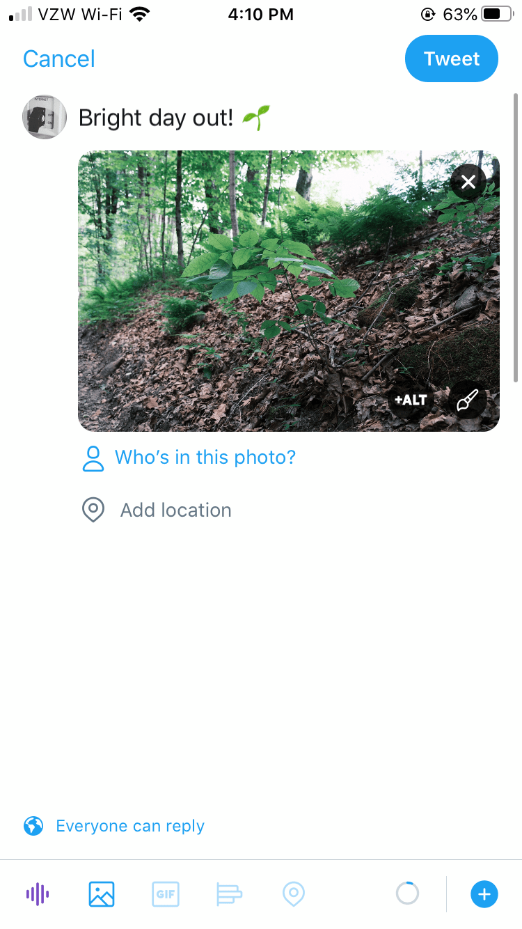
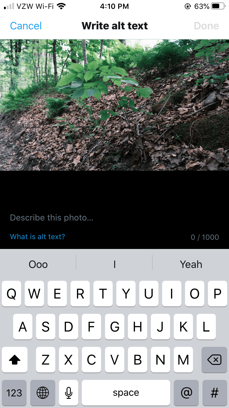
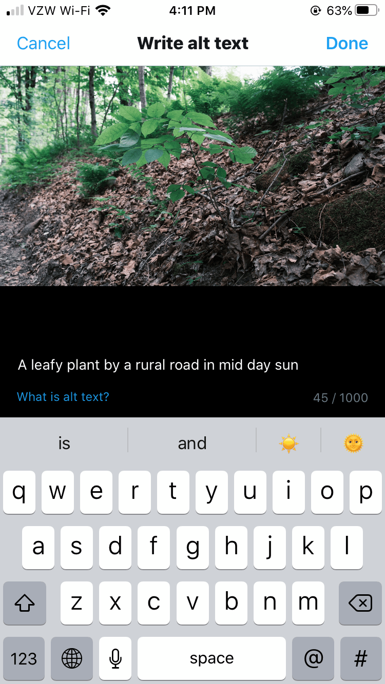
Official Twitter guide for adding alt text https://help.twitter.com/en/using-twitter/picture-descriptions
Twitter has a nice UI for describing images too. When composing a tweet and attaching an image, a “+ALT” button appears on the image, which allows access to the image description entry view. Type a short description, click done, and you’re all set!
MailChimp
Official MailChimp guide for adding alt text https://mailchimp.com/help/add-alt-text-to-images/